


What is Matplotlib?
It is the most popular plotting library for Python and it gives you control over every aspect of a figure. It works great with Pandas and NumPy.
- Figure: It is a whole figure which may contain one or more than one axes.
- Axes: It is what we generally think of as a plot. Each axes has a title, an x-label and a y-label.
- Axis: They are the number line like objects and take care of generating the graph limits.
- Artist: Everything which one can see on the figure is an artist
Installation
- you can install it with either of the below commands, depends on what distribution you are using.
conda install matplotlib or pip install matplotlib
- There are various types of plot that the Matplotlib is capable of.
How to Plot
There are two ways that we plot a graph using the matplotlib.
- Functional
- Object-Oriented
Functional
- Lets first import matplotlib and create x and y for plotting
import matplotlib.pyplot as plt
import numpy as np
x = np.linspace(0,5,11)
y = x**2
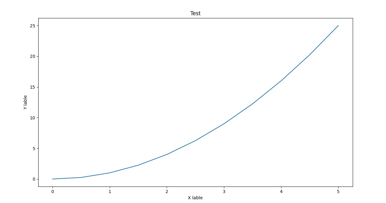
#FUNTIONAL
plt.plot(x,y)
plt.xlabel('X lable')
plt.ylabel('Y lable')
plt.title('Test')
plt.show()
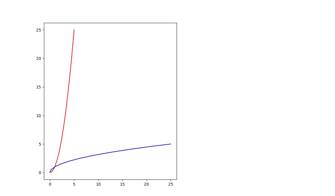
- If you want to add multiple plots in the same canvas then we can do it like this.
#add multi plots
plt.subplot(1,2,1)
plt.plot(x,y,'r')
plt.plot(y,x,'b')
plt.show()
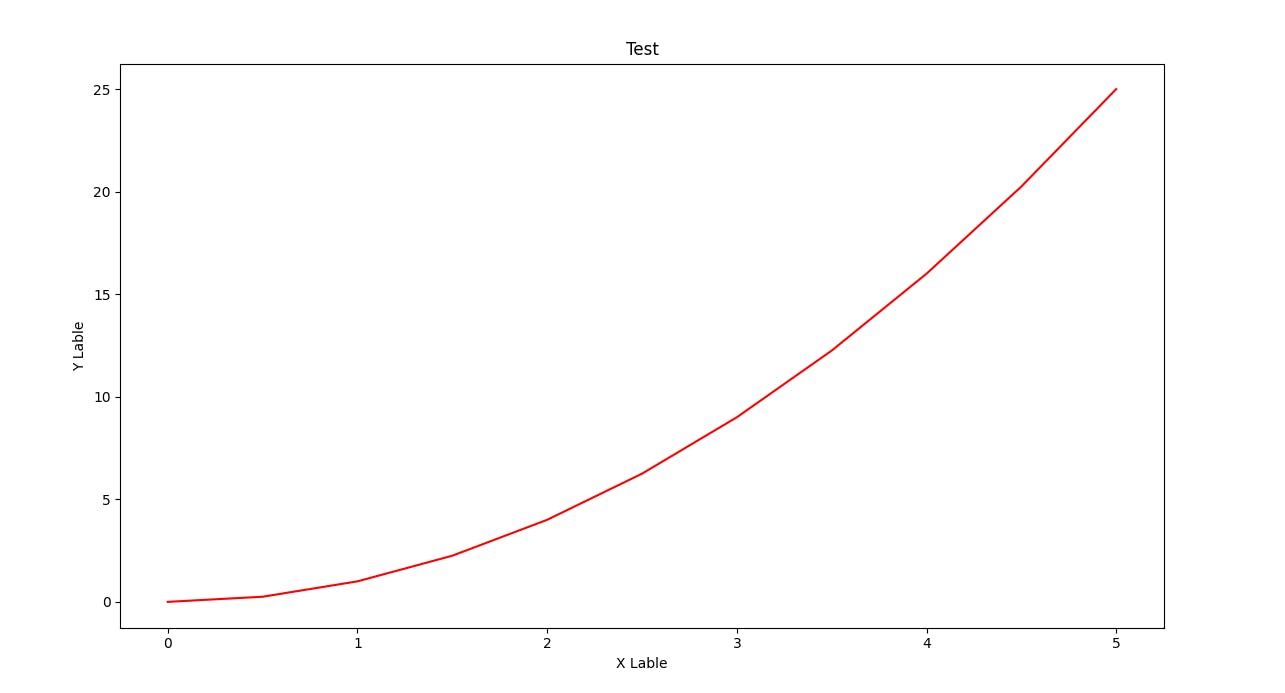
Object Oriented
In this case, we have more flexibility towards the plots and the axis that we create.
import matplotlib.pyplot as plt
import numpy as np
x = np.linspace(0,5,11)
y = x**2
fig = plt.figure()
axes = fig.add_axes([0.1,0.1,0.8,0.8])
axes.plot(x,y,'r')
axes.set_xlabel('X Lable')
axes.set_ylabel('Y Lable')
axes.set_title('Test')
plt.show()
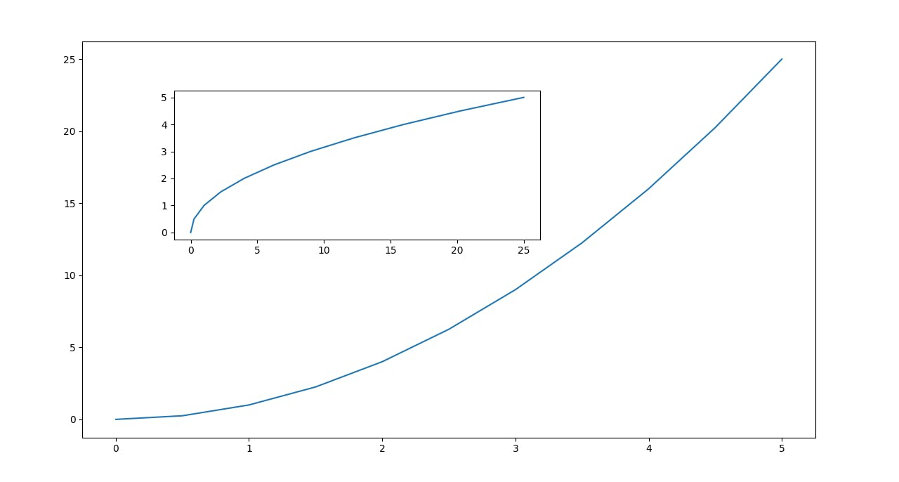
- If you want to add multiple plots in the same canvas then we can do it like this.
fig = plt.figure()
axes1 = fig.add_axes([0.1,0.1,0.8,0.8])
axes2 = fig.add_axes([0.2,0.5,0.4,0.3])
axes1.plot(x,y)
axes2.plot(y,x)
plt.show()
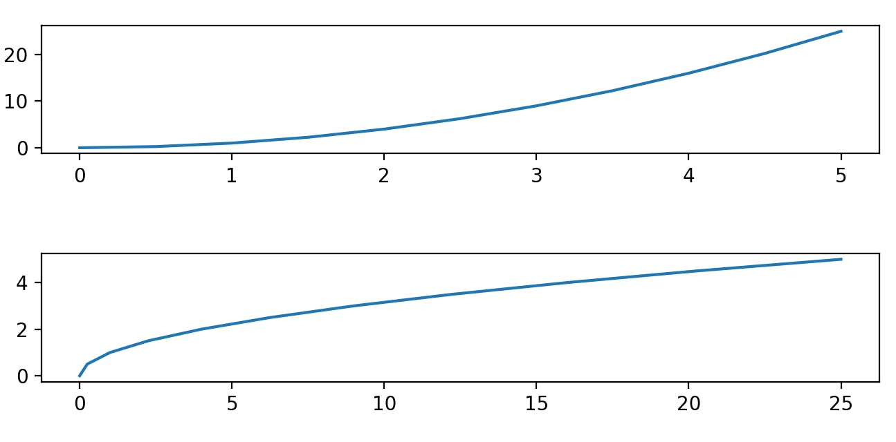
- In order to create multiple plots onto the same canvas we can make use of the following. We can change the number of rows and columns.
fig,axes = plt.subplots(nrows=1,ncols=2)
axes[0].plot(x,y)
axes[1].plot(y,x)
plt.tight_layout()
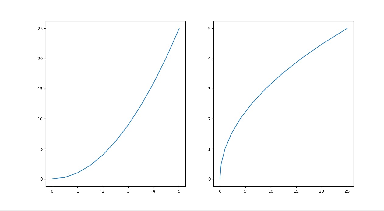
Figure size and DPI
- Let's see how can we edit the figure size and DPI. If we don't mention the DPI then it will take the default value.
import matplotlib.pyplot as plt
import numpy as np
x = np.linspace(0,5,11)
y = x**2
fig,axes = plt.subplots(nrows=2,ncols=1,figsize=(8,2),dpi=200)
axes[0].plot(x,y)
axes[1].plot(y,x)
plt.tight_layout()
plt.show()
- In order to save the above file as any extension you want, we can use the following function.
fig.savefig('my_picture.jpg')
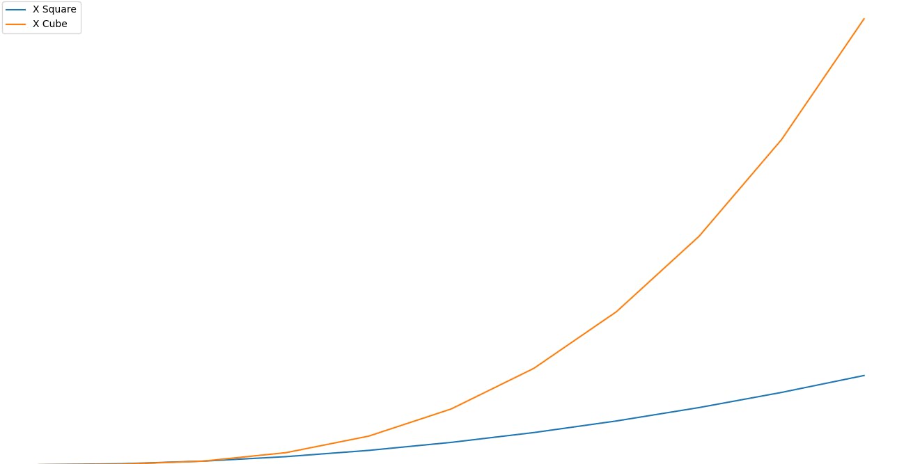
Legend
- A legend is an area describing the elements of the graph. In the matplotlib library, there's a function called legend() which is used to Place a legend on the axes.
- Let's see how we can create one.
import matplotlib.pyplot as plt
import numpy as np
x = np.linspace(0,5,11)
y = x**2
fig2 = plt.figure()
ax = fig2.add_axes([0,0,1,1])
ax.plot(x,x**2,label='X Square')
ax.plot(x,x**3,label='X Cube')
ax.legend()
plt.tight_layout()
plt.show()
Plot Appearance
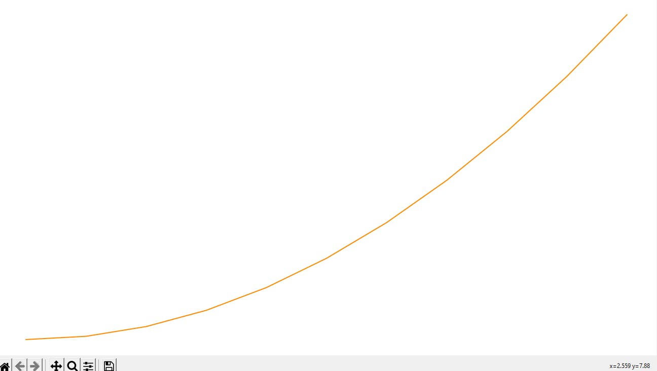
- Let's see how to add colours to our plot.
import matplotlib.pyplot as plt
import numpy as np
x = np.linspace(0,5,11)
y = x**2
fig3 = plt.figure()
ax3 = fig3.add_axes([0,0,1,1])
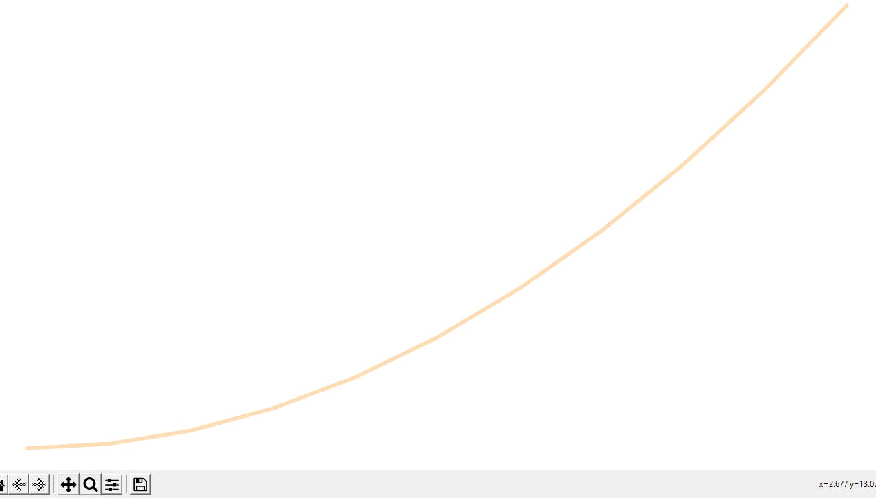
ax3.plot(x,y,color='#ff8c00')
plt.show()
- If we want to change the thickness of the line as well as the transparency of the line.
fig3 = plt.figure()
ax3 = fig3.add_axes([0,0,1,1])
ax3.plot(x,y,color='#ff8c00',linewidth=4,alpha=0.3)
plt.show()
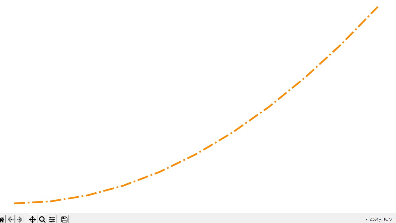
- We can also change the line style if we want our line to be just a solid line or dotted or pretty much anything else.
fig3 = plt.figure()
ax3 = fig3.add_axes([0,0,1,1])
ax3.plot(x,y,color='#ff8c00',linewidth=4,linestyle='-.')
plt.show()
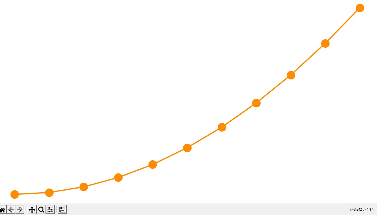
- If you want to set each marker point for each of the values of x then we can do as follows.
fig3 = plt.figure()
ax3 = fig3.add_axes([0,0,1,1])
ax3.plot(x,y,color='#ff8c00',linewidth=3,marker='o',markersize=20)
plt.show()
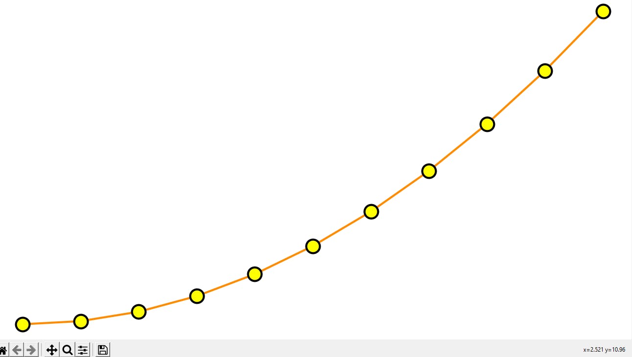
- We can really customize a bit more, like the edge colour, width as well as marker colour.
fig3 = plt.figure()
ax3 = fig3.add_axes([0,0,1,1])
ax3.plot(x,y,color='#ff8c00',linewidth=3,marker='o',markersize=20,
markerfacecolor='yellow',markeredgewidth=3,markeredgecolor='black')
plt.show()
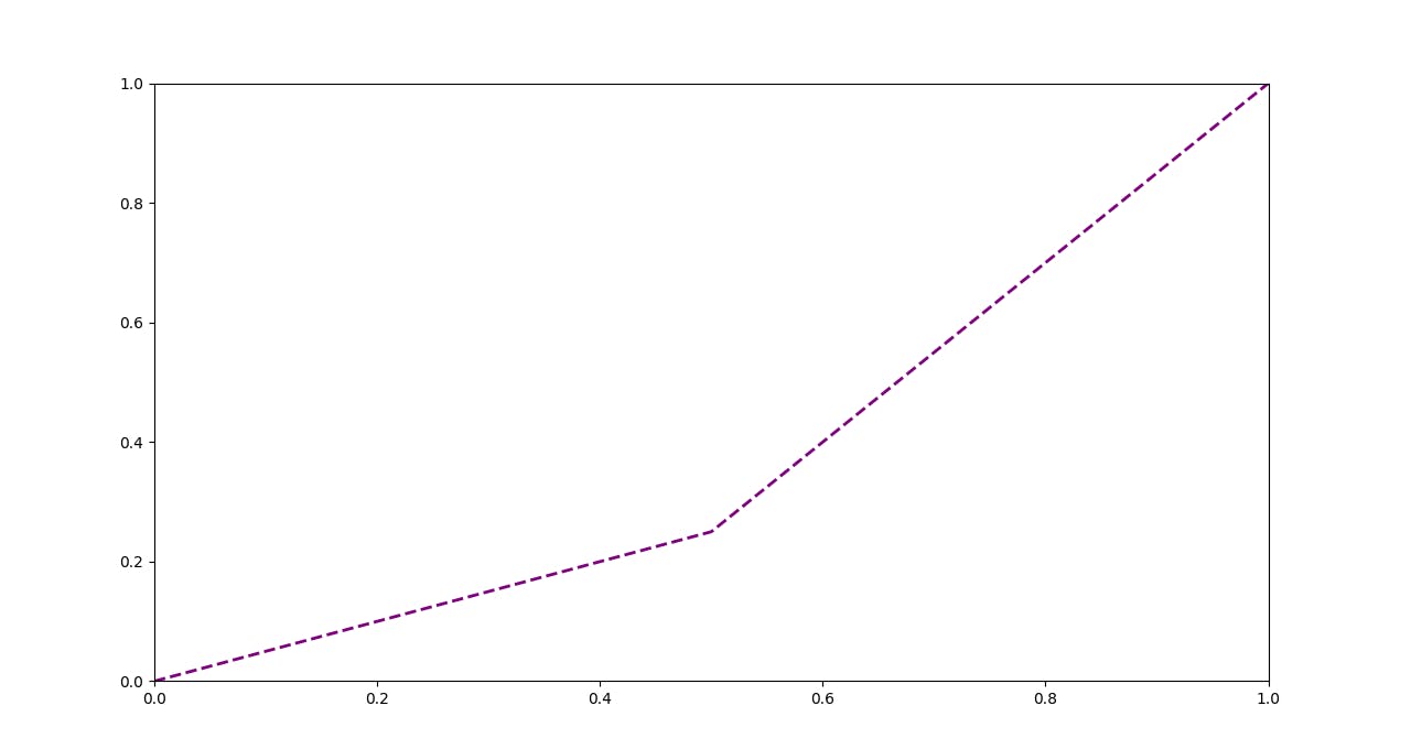
- Let's now set the limits of the axes to the upper bound and the lower bound.
fig4 = plt.figure()
ax4 = fig4.add_axes([0,0,1,1])
ax4 = fig4.add_subplot(111)
ax4.plot(x,y,color='purple',linewidth=2,linestyle='--')
ax4.set_xlim([0,1])
ax4.set_ylim([0,1])
plt.show()
Thank-you!
I am glad you made it to the end of this article. I hope you got to learn something, if so please leave a Like which will encourage me for my upcoming write-ups.
- My GitHub Repos
- Connect with me on Linkedin
- Start your own blogs