


What is Seaborn?
Seaborn is a Python data visualization library based on matplotlib. It provides a high-level interface for drawing attractive and informative statistical graphics. It has beautiful styles. Seaborn helps you explore and understand your data. Its plotting functions operate on data frames and arrays containing whole datasets and internally perform the necessary semantic mapping and statistical aggregation to produce informative plots. Its dataset-oriented, declarative API lets you focus on what the different elements of your plots mean, rather than on the details of how to draw them. Here is the official documentation for Seaborn.
- in order to install seaborn you can give the command
pip install seaborn

#OR

conda install seaborn
Distribution Plots
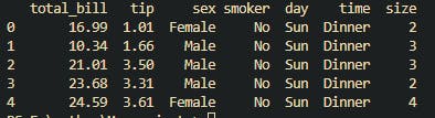
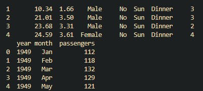
- By default, there are various datasets available for seaborn which you can load. Below we have loaded TIPS datasets which contains who gave how much tip.
import seaborn as sns
import matplotlib.pyplot as plt
#Seaborn has some inbuild datasets which you can load
tips = sns.load_dataset('tips')
print(tips.head())
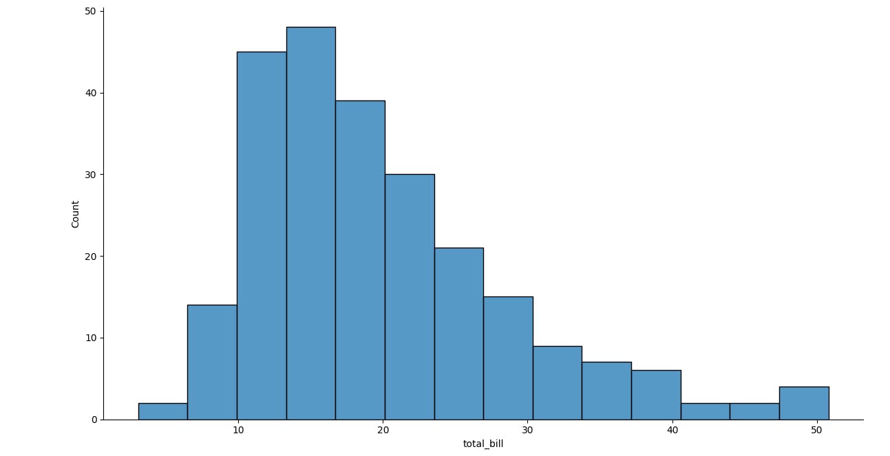
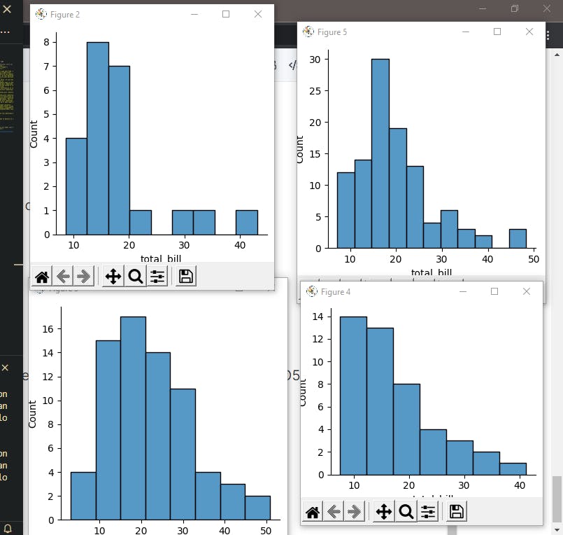
- Let's see the first plot type DIST PLOT. It's a way to see a uni-variable distribution.
sns.displot(tips['total_bill'])
plt.show()
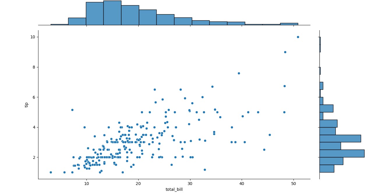
- Let's see JOINT PLOT, here we can combine two DIST plots. In the below code we have compared two separate things, total_bill and the tip.
sns.jointplot(x='total_bill',y='tip',data=tips)
plt.show()
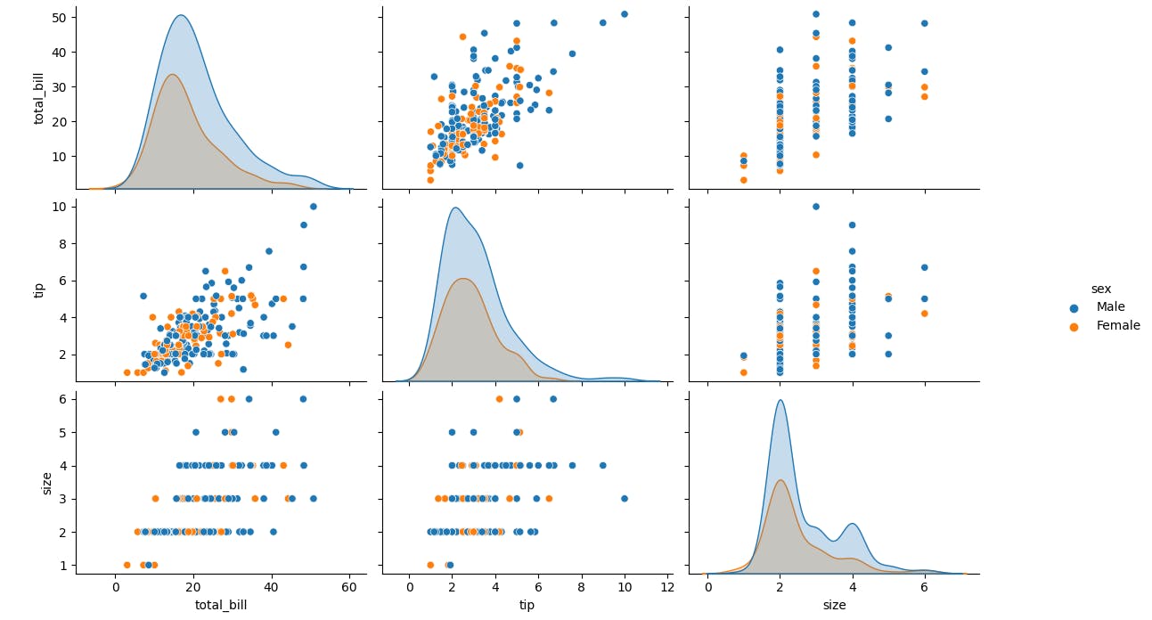
- Let's see PARI PLOT, here we plot pairwise relationship across the table.
sns.pairplot(tips,hue='sex)
plt.show()
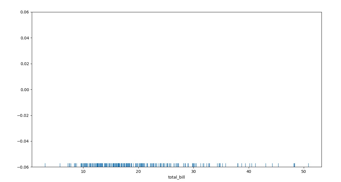
- Let's See how RUG PLOT works. It just draws a dash for every uniform variables.
sns.rugplot(tips['total_bill'])
plt.show()
- KDE Plots stands for Kernal Density Estimation Plots.
Categorical Plots
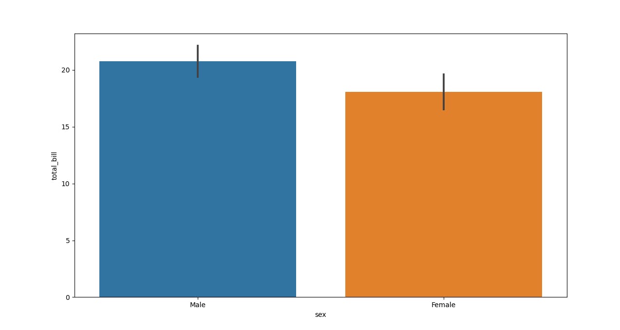
- BAR PLOT is the most common type of Categorical Plots that we can see. You can think of this as the visualization of the action.
sns.barplot(x='sex',y='total_bill',data=tips)
plt.show()
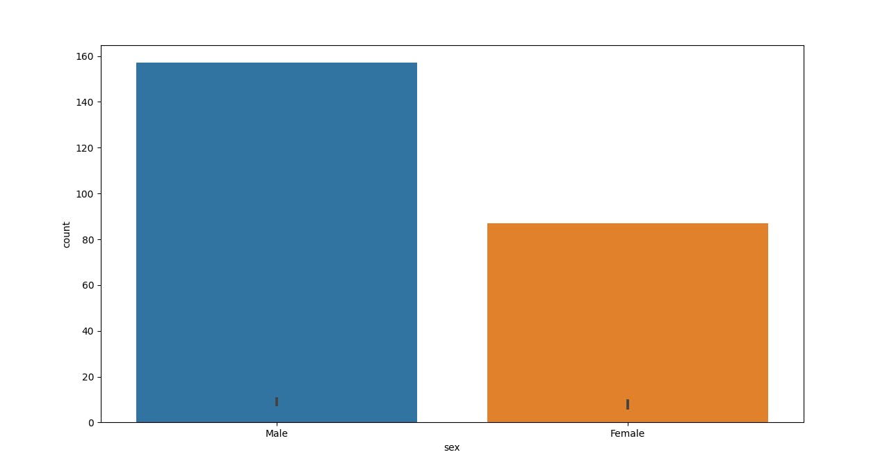
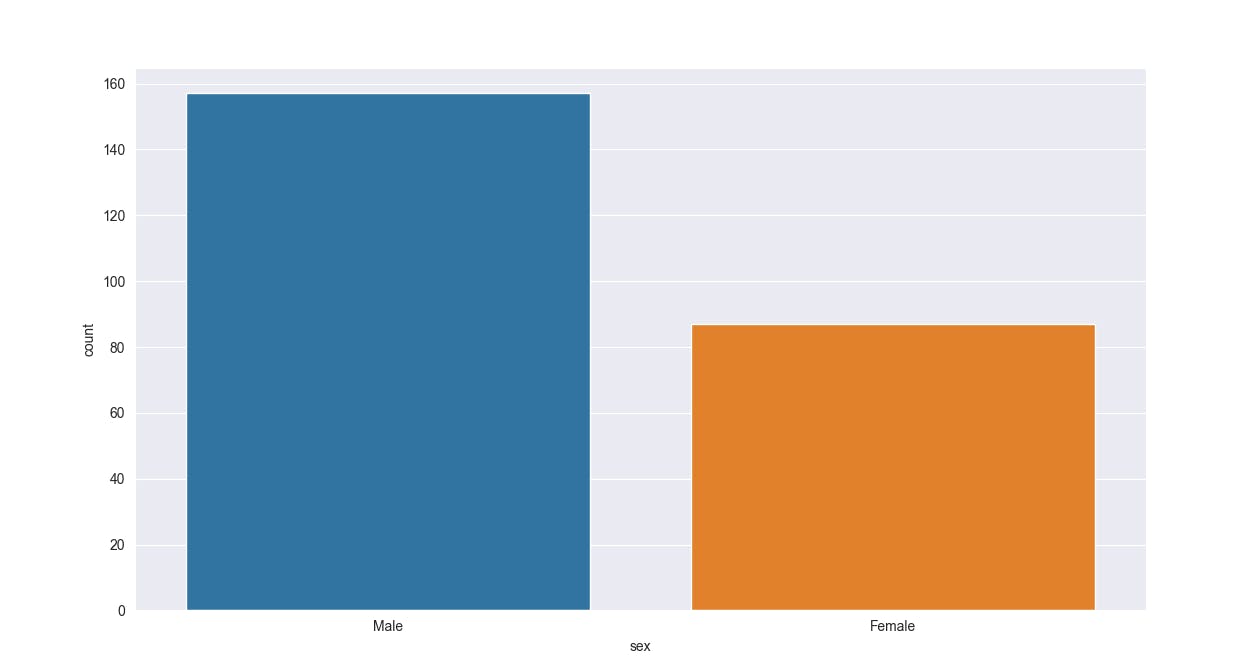
- COUNT PLOT is the same as BAR PLOT instead it counts the occurrence of values.
sns.countplot(x='sex',data=tips)
plt.show()
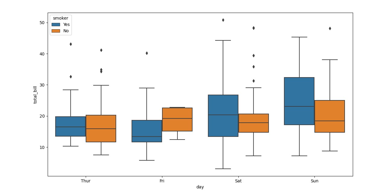
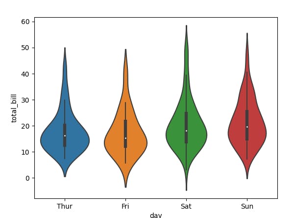
- BOX PLOT and VIOLIN PLOT Distribution of categorical data.
sns.boxplot(x='day',y='total_bill',data=tips,hue='smoker')
plt.show()
sns.violinplot(x='day',y='total_bill',data=tips)
plt.show()
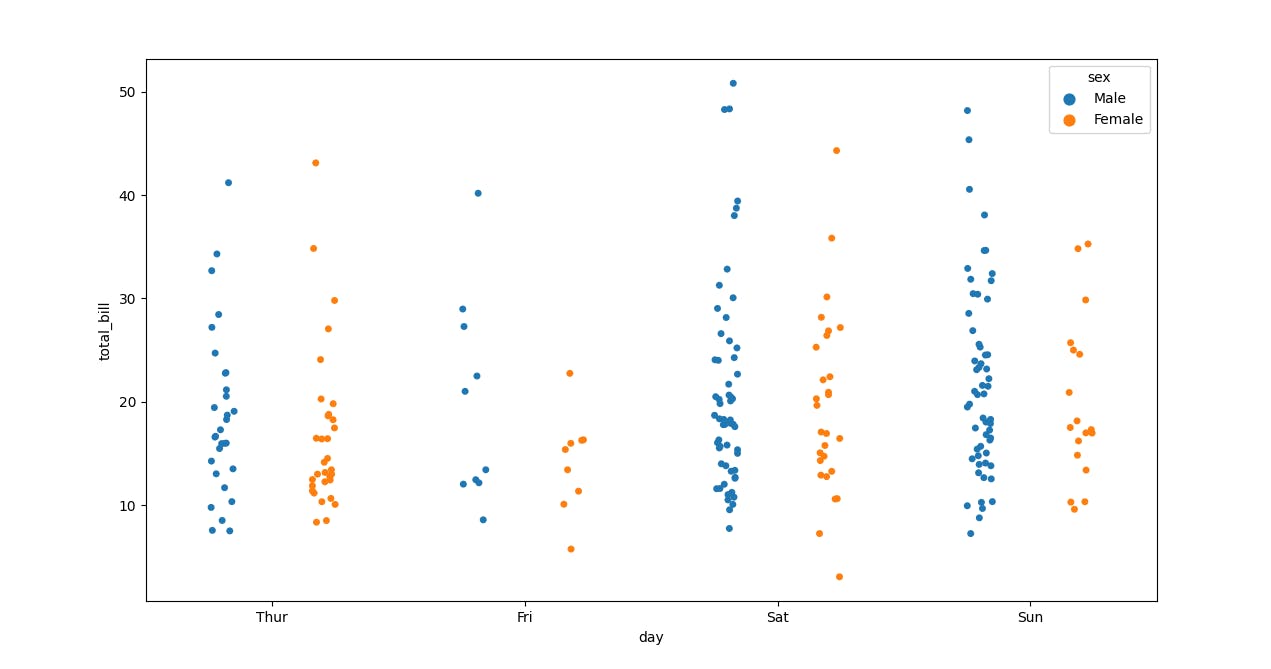
- Let's see how to plot a STRIP PLOT and split it as well as assign them colours according to their gender.
sns.stripplot(x='day',y='total_bill',data=tips,jitter=True,hue='sex',dodge=True)
plt.show()
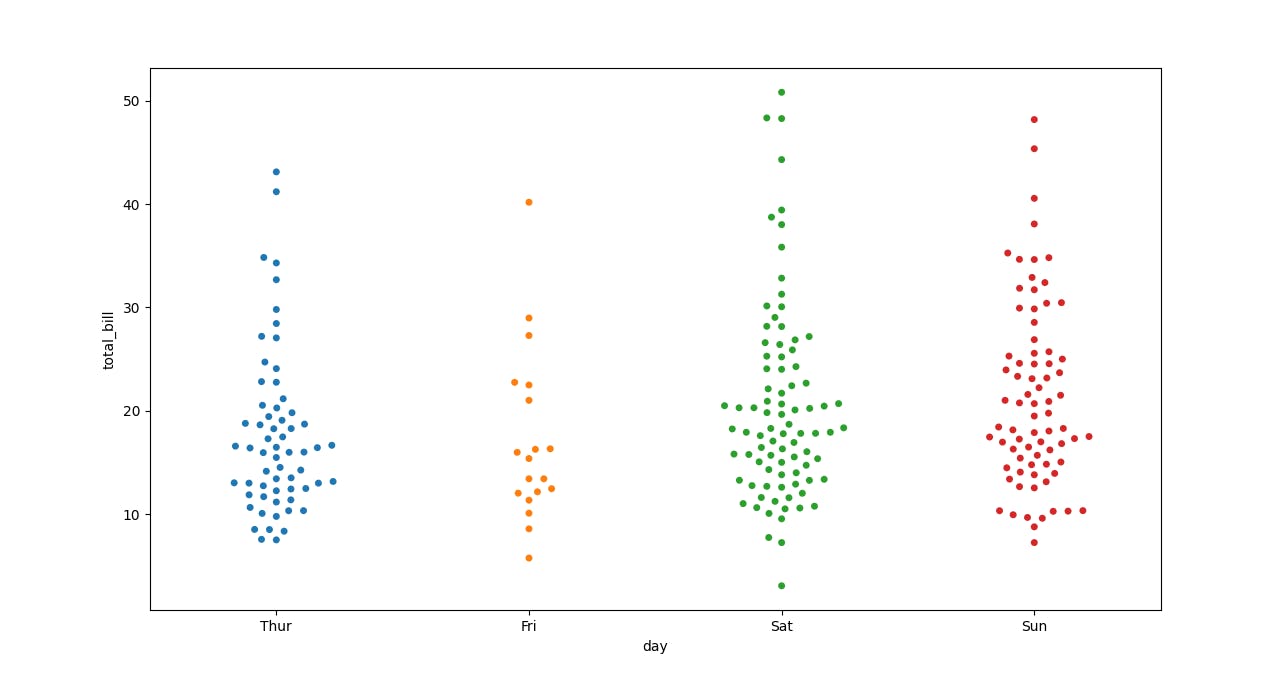
- If we combine the STRIP PLOT and the VIOLIN PLOT we will get a SWARM PLOT
sns.swarmplot(x='day',y='total_bill',data=tips)
plt.show()
- Let's see about FACTOR PLOT, this is the general form of all these plots. So in the end, you need to mention what type of plot you want just mentioned that we want a bar plot. Now it renamed to CAT PLOT, so you can use either.
sns.factorplot(x='day',y='total_bill',data=tips,kind='bar')
plt.show()
Matrix Plots
- These are basically heatmaps. Let's First create a setup or data input on which we are going to plot the MATRIX PLOTS .
import seaborn as sns
import matplotlib.pyplot as plt
import numpy as np
tips = sns.load_dataset('tips')
flights = sns.load_dataset('flights')
print(tips.head())
print(flights.head())
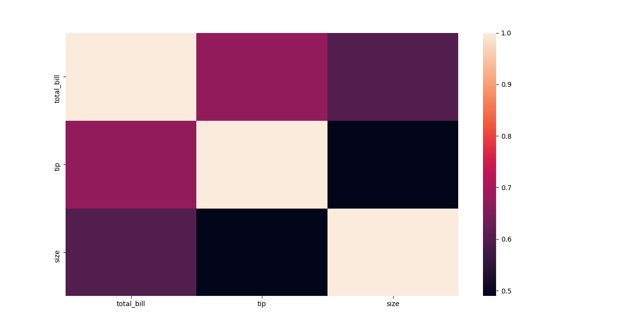
- In order for the heat map to work properly the dataset should be in a matrix form.
tc = tips.corr()
sns.heatmap(tc)
plt.show()
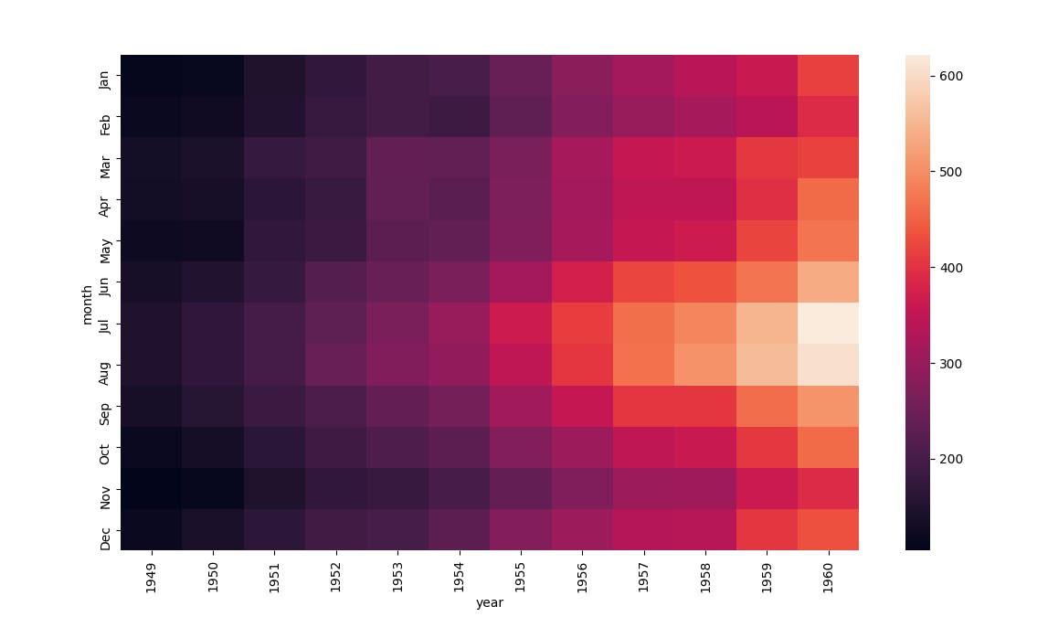
fm = flights.pivot_table(index='month',columns='year',values='passengers')
sns.heatmap(fm)
plt.show()
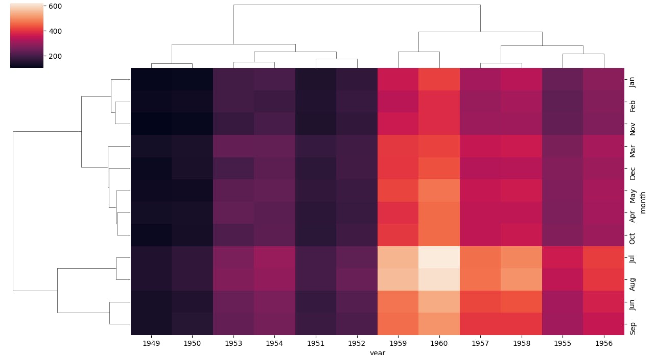
- Let's now see how a CLUSTER MAP looks like. It's basically a cluster of Heat Map.
fm = flights.pivot_table(index='month',columns='year',values='passengers')
sns.clustermap(fm)
plt.show()
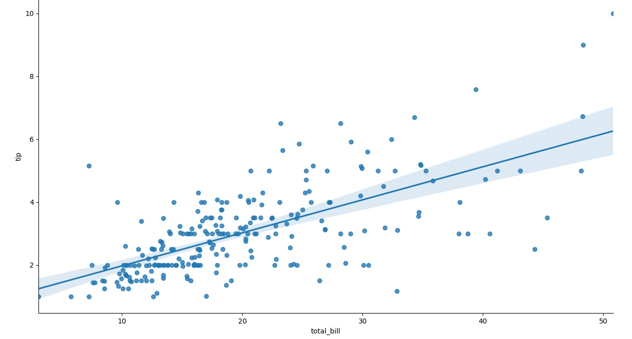
Regression Plot
The Regression plots in seaborn are primarily intended to add a visual guide that helps to emphasize patterns in a dataset during exploratory data analyses.
We will be working with the TIPS dataset that we previously loaded. Let's see how a regression plot looks like
sns.lmplot(x='total_bill',y='tip',data=tips)
plt.show()
Grids
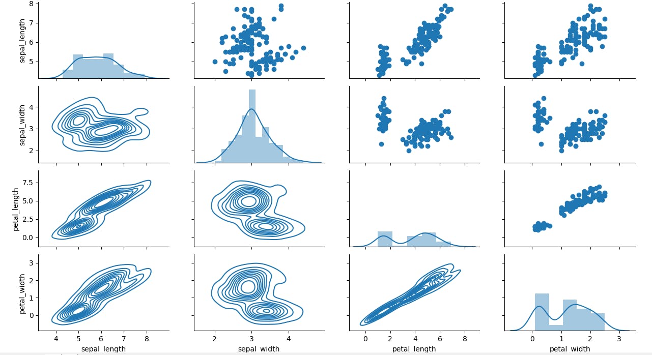
- Grids are general types of plots that allow you to map plot types to grid rows and columns, which helps you to create similar character-separated plots. It's like the pair plot just we will get all the plots empy and we need to customize it according to our own needs.
iris = sns.load_dataset('iris')
var = sns.PairGrid(iris)
#var.map(plt.scatter)
# if you want to specify what to mention on the diagonal
var.map_diag(sns.distplot)
var.map_upper(plt.scatter)
var.map_lower(sns.kdeplot)
plt.show()
- Facet Grid object takes a data frame as input and the names of the variables that will form the row, column, or hue dimensions of the grid.
g = sns.FacetGrid(data=tips,col='time',row='smoker')
g.map(sns.displot,'total_bill')
plt.show()
Style and colour
- Here we will see how to stylize your plots, first, let's see how to change the background and also remove the spike/spines.
sns.set_style(style='darkgrid') # to set the background
sns.despine(left=True,bottom=True) # to remove the peaks
sns.countplot(x='sex',data=tips)
plt.show()
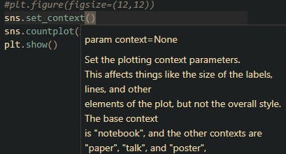
- We can give the context of the plot using set_context and there are four main choices you can choose from-> Notebook, paper, poster and talk
- We can make use of HUE to set the colours for specific arguments and also we will make use of PALETTE
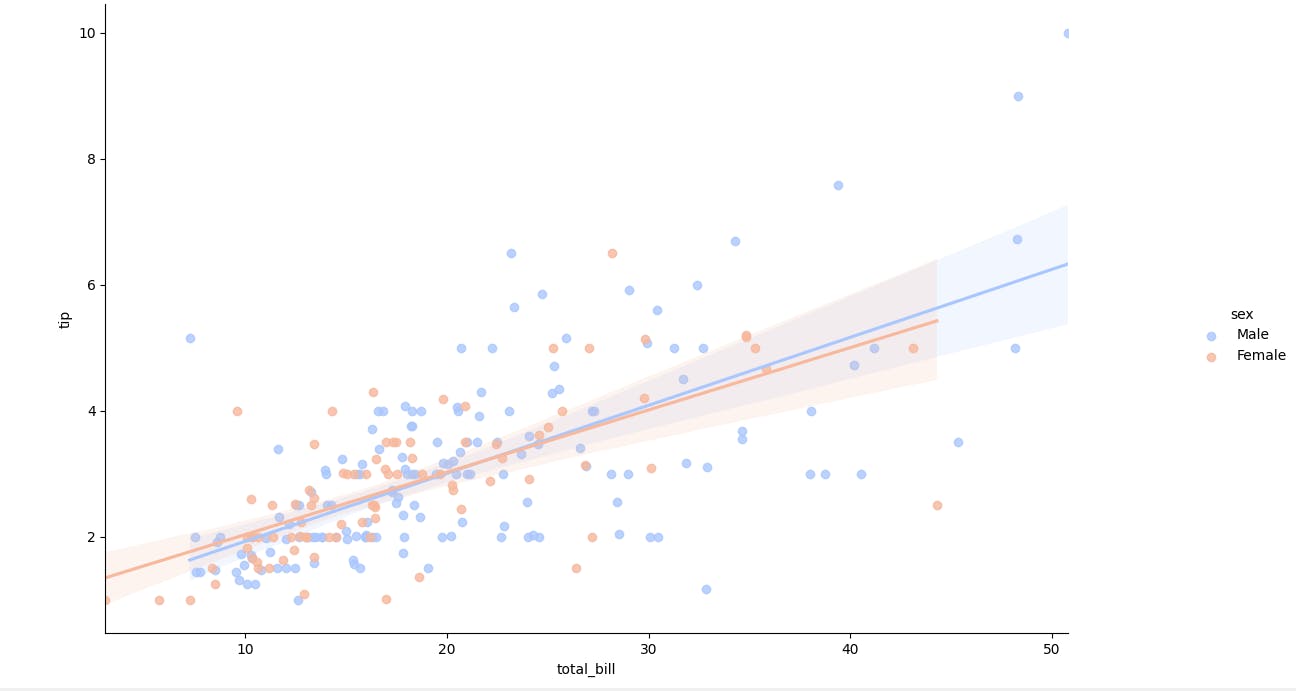
sns.lmplot(x='total_bill',y='tip',data=tips,hue='sex',palette='coolwarm')
plt.show()
Thank-you!
I am glad you made it to the end of this article. I hope you got to learn something, if so please leave a Like which will encourage me for my upcoming write-ups.
- My GitHub Repos
- Connect with me on Linkedin
- Start your own blogs